The Design Guide.
The Design Guide. has been recognized by American Design Awards in Public Service + Pro Bono category
The Design Guide was developed collaboratively by me and two fellow designers during our graduate year at RIT, under the mentorship of Professor Hye-Jin while serving as research assistants. We created this resource to help non-design students and faculty grasp essential design principles. Our goal is for the guide to function as a practical, approachable tool that can be applied to everyday tasks—empowering users to enhance their projects and elevate the overall quality of their work.
What is The Design Guide?
It’s a curated collection of step-by-step tutorials, downloadable templates, and practical tools designed specifically for aspiring engineers, scientists, and entrepreneurs. The guide provides everything users need to approach everyday design challenges with clarity and confidence.
My responsibilities included creating the Leading and Resources pages, designing hero illustrations, crafting homepage icons, and developing the style guide. As a team, we collaborated across all stages of the project—from conducting research and producing deliverables such as user surveys and competitive analyses to synthesizing insights into user summaries after testing. We also prototyped the Design Guide in Marvel for usability testing and to showcase the project at the RIT Faculty Show.
Designers
Joahn Kim (Namhee)
Aditi Khazanchi
Logan Bicknell
Duration
October 2017 - May 2019
Role
UX/UI Designer
Recognition
Leading
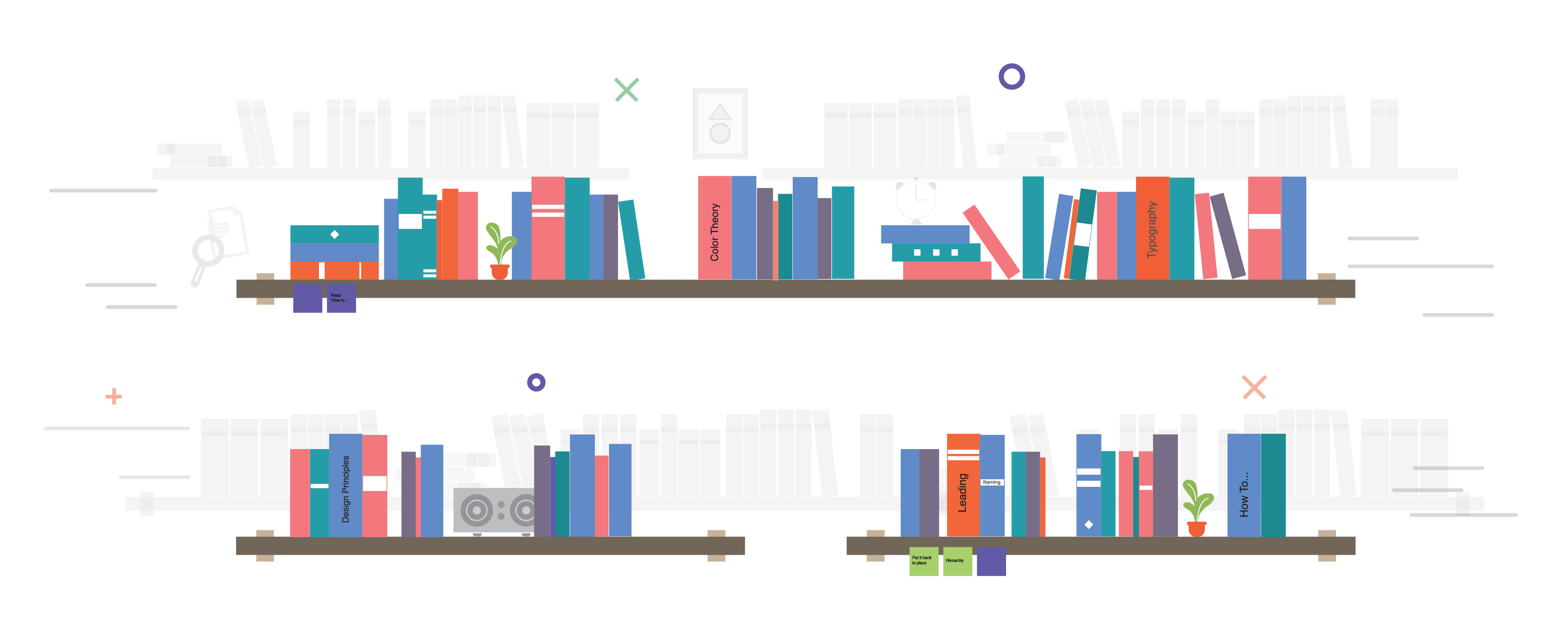
When we began mapping the user flow after conducting our initial survey, we believed we needed separate pages for each design principle. One of these was a terminology section dedicated to leading. I was responsible for creating this page with the goal of helping non-design students and faculty quickly understand the concept through clear, accessible visuals.
Our user testing confirmed that participants learned more effectively when information was presented visually rather than through dense text, reinforcing our decision to prioritize visual explanations in this section.
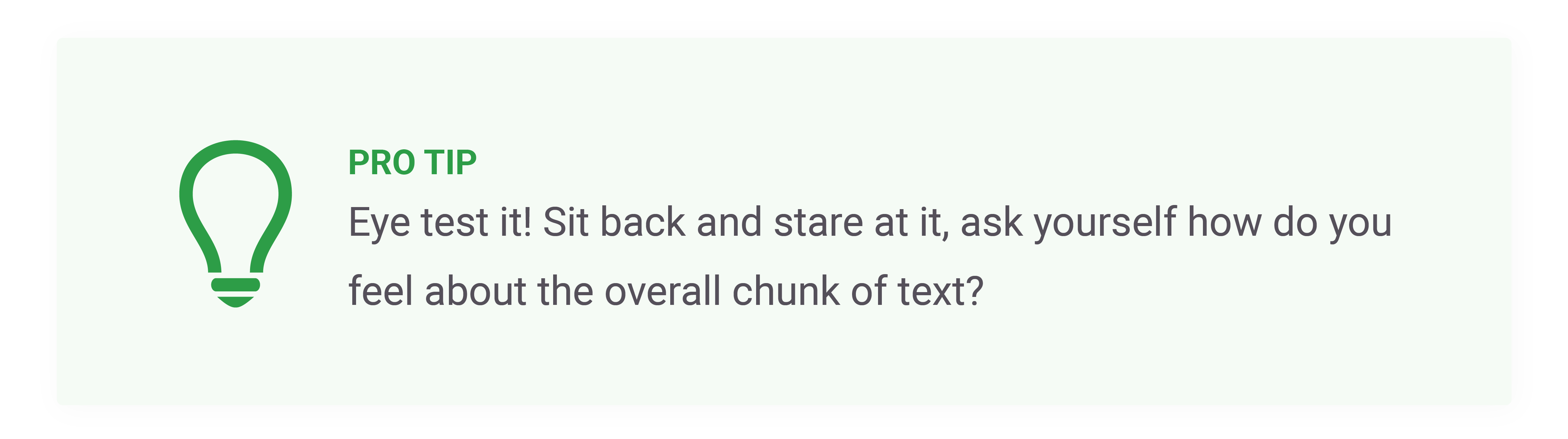
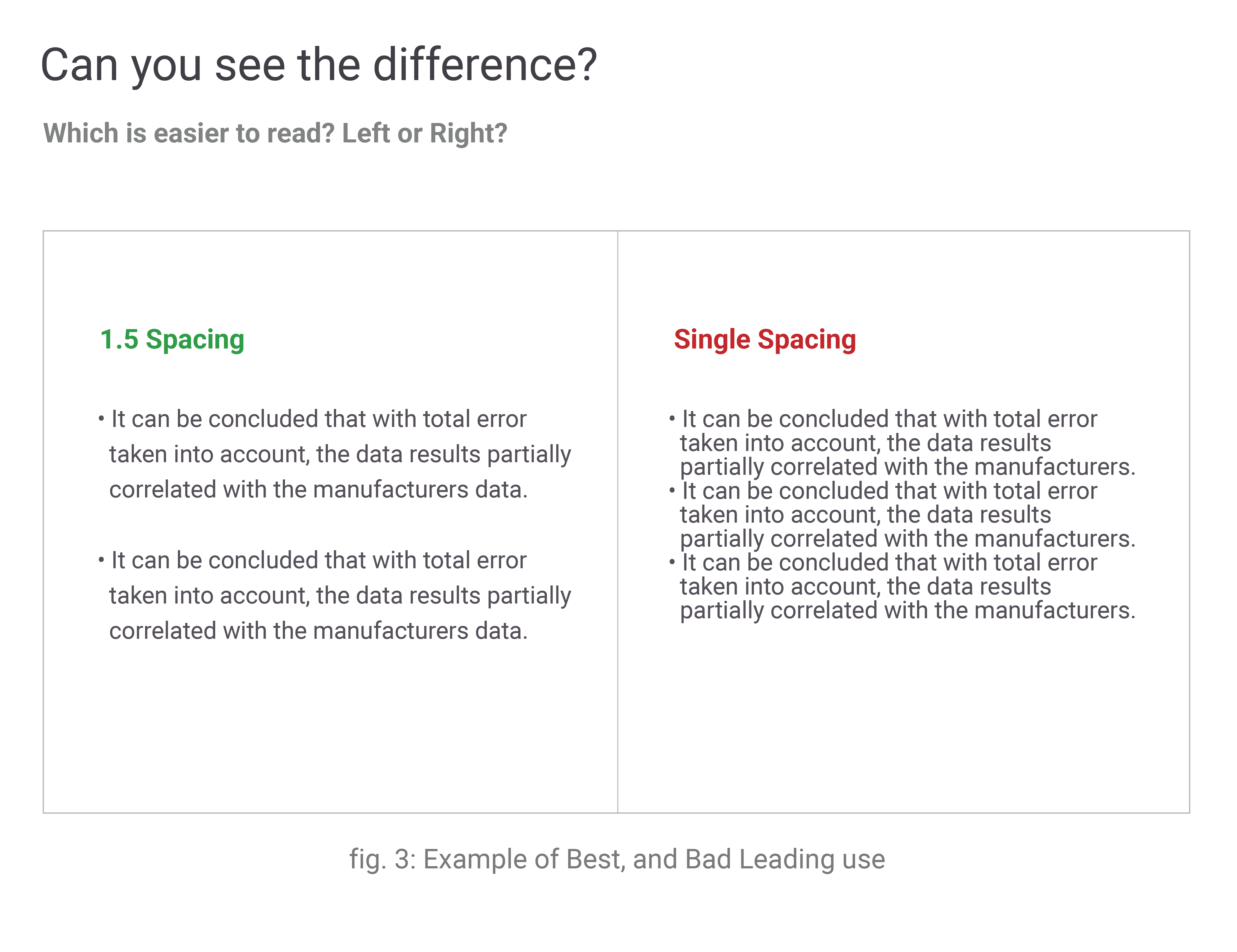
To support this learning style, I created “Bad vs. Good” visual comparisons that highlighted common mistakes and effective solutions at a glance. I also incorporated concise tooltips to offer contextual guidance without overwhelming the user, making the learning experience more intuitive and engaging.
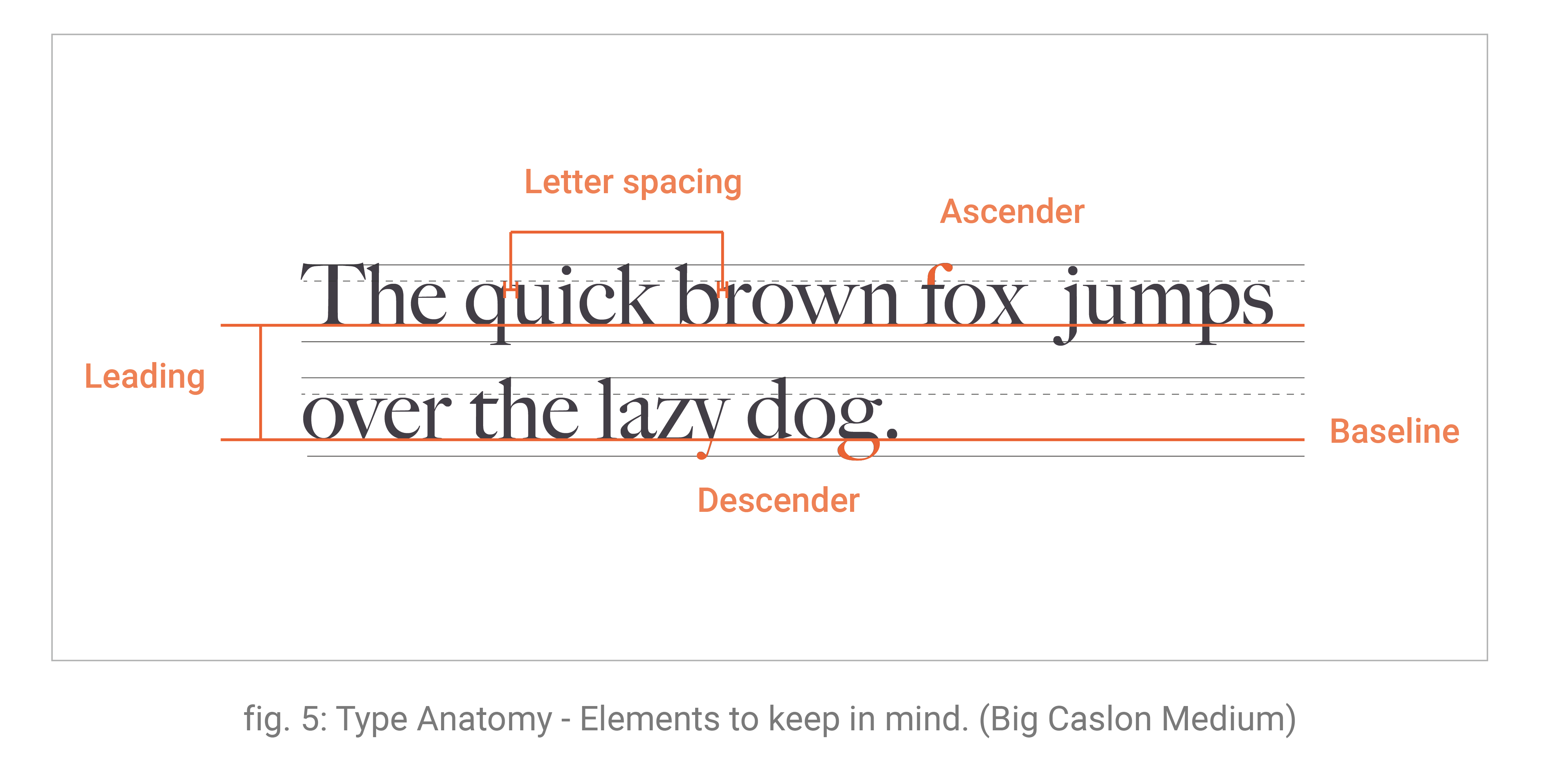
A dedicated callout section further breaks down key aspects of type anatomy, helping users visualize the specific elements being referenced. These visual markers improve comprehension as they move through the content, reinforcing the concepts introduced throughout the page.
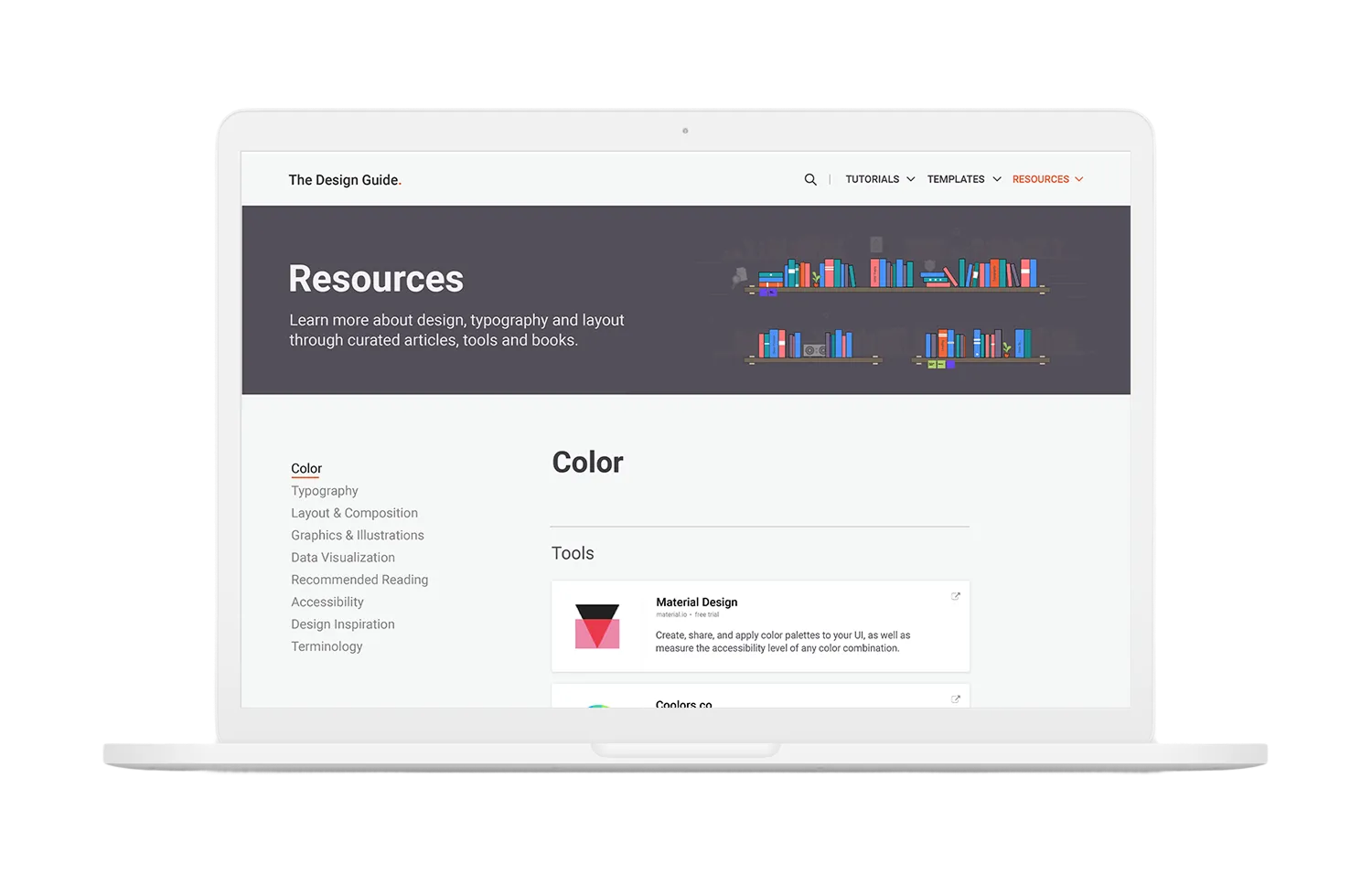
Resources
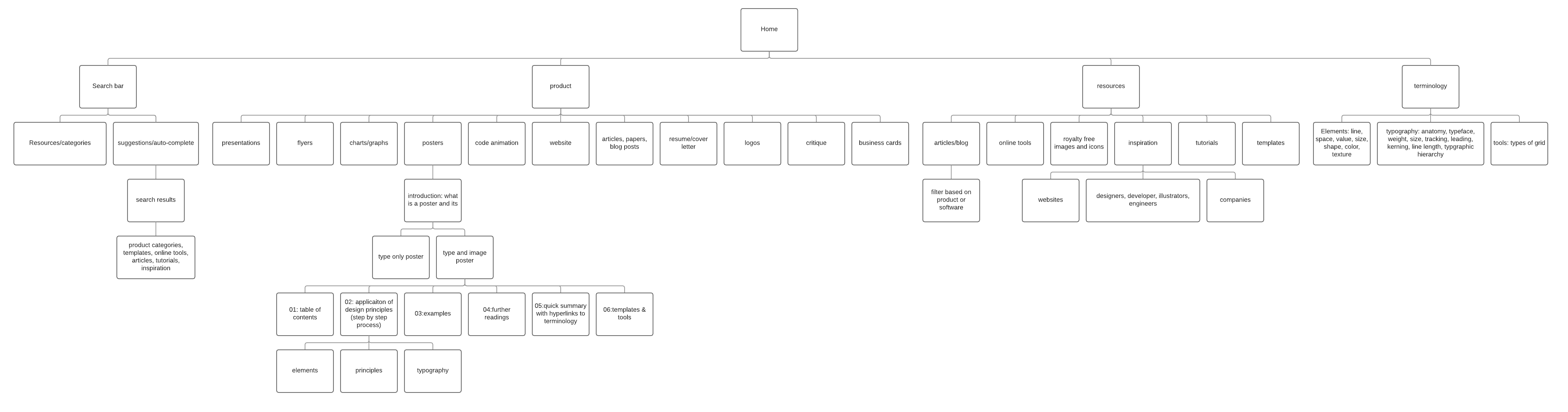
The Resources page was designed to offer students and faculty a collection of free tools and learning materials organized by category. Since everyone learns differently, our goal was to create a flexible, supportive space where users could explore design topics in the format that works best for them.
On the Color resource page, for example, we divided content into four categories—Tools, How-To Tutorials, Articles, and Books. Survey data showed that users had mixed learning preferences: some preferred video-based learning, while others wanted fast access to tools or written references. To support these diverse needs, we incorporated all resource types into clearly separated sections.
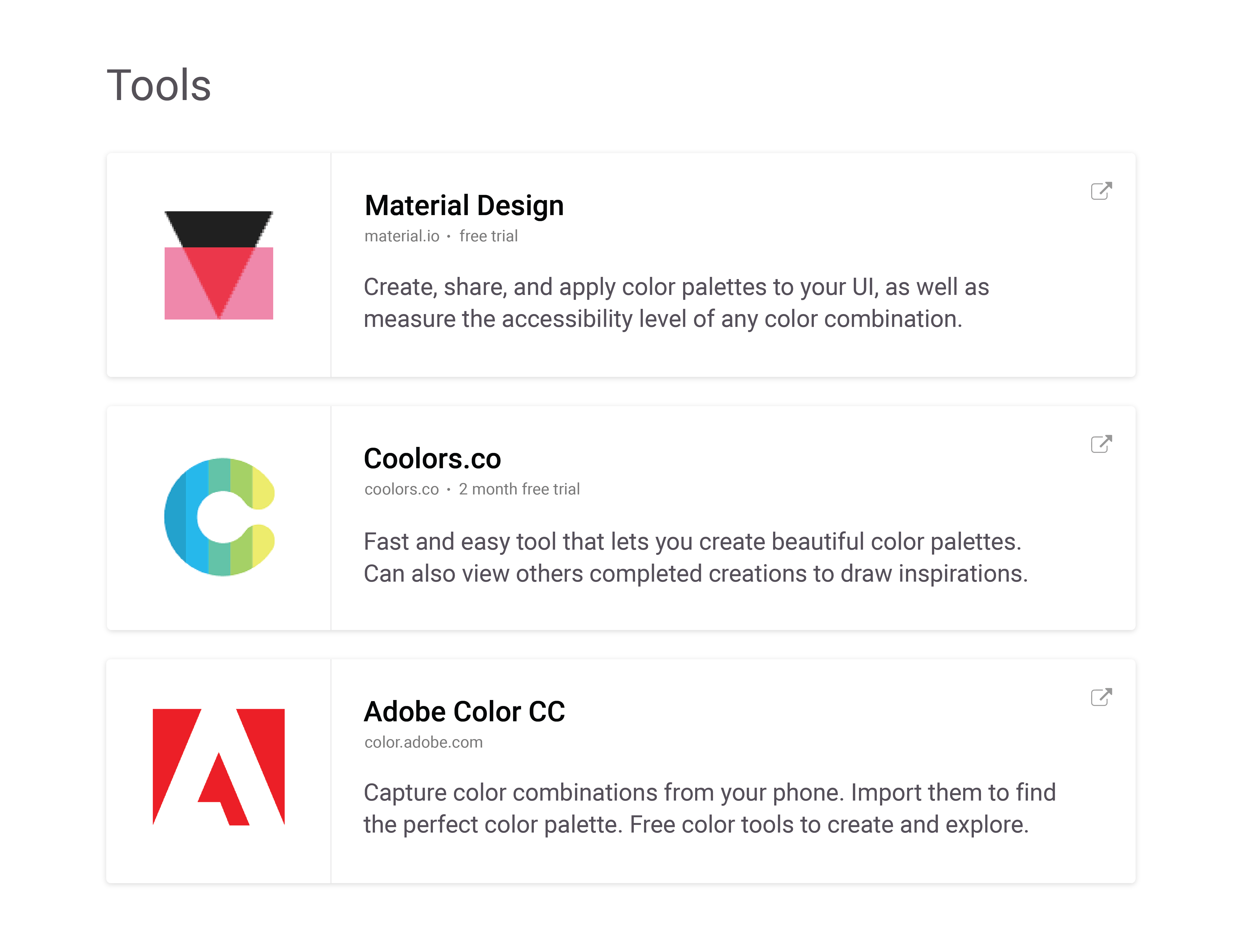
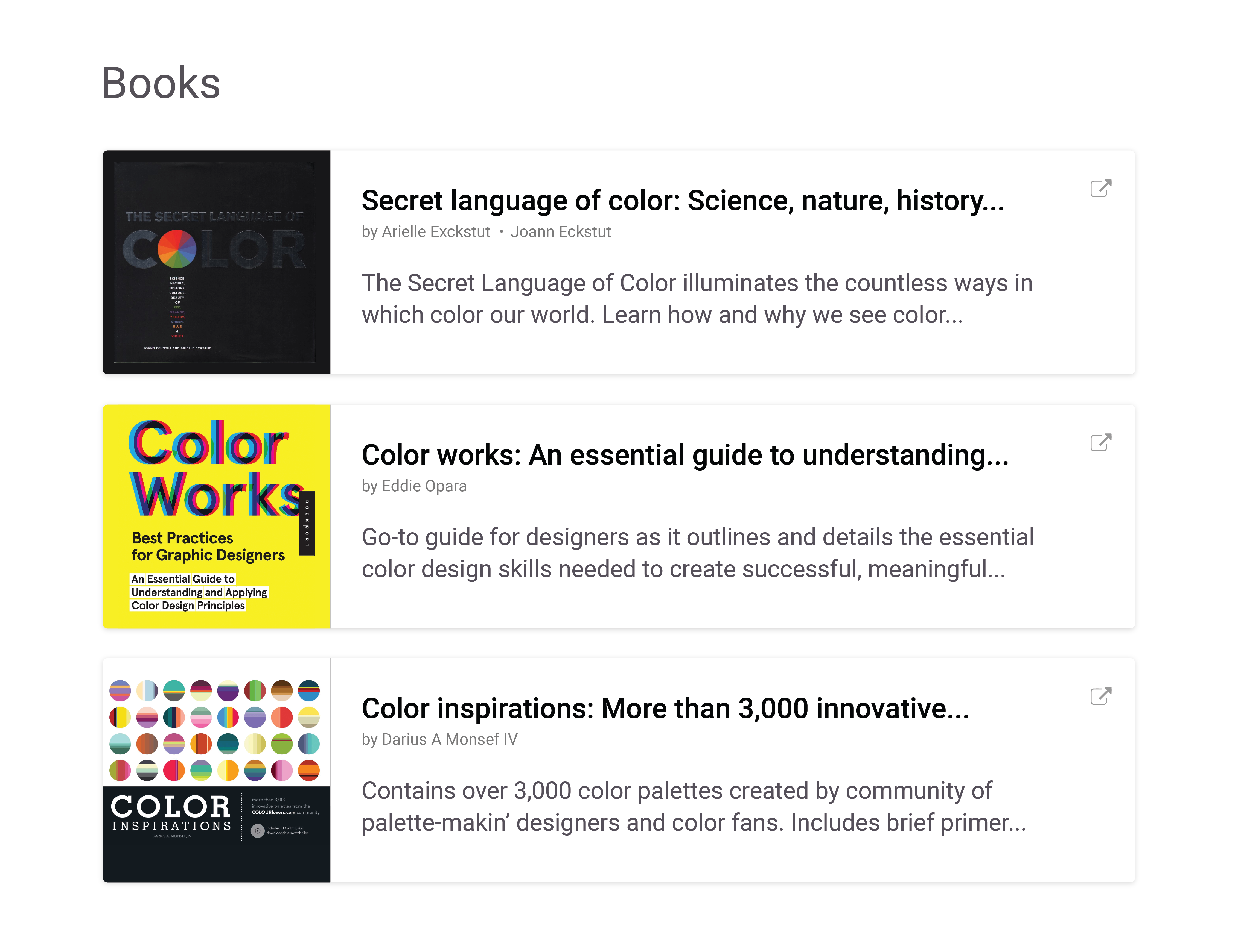
The layout is intentionally simple and straightforward, using contrasting colors, subtle rounded corners, and clean components to create a friendly yet clear browsing experience. Each resource card features a visual preview on the left to provide immediate context, paired with a concise description to help users quickly understand what each section offers.
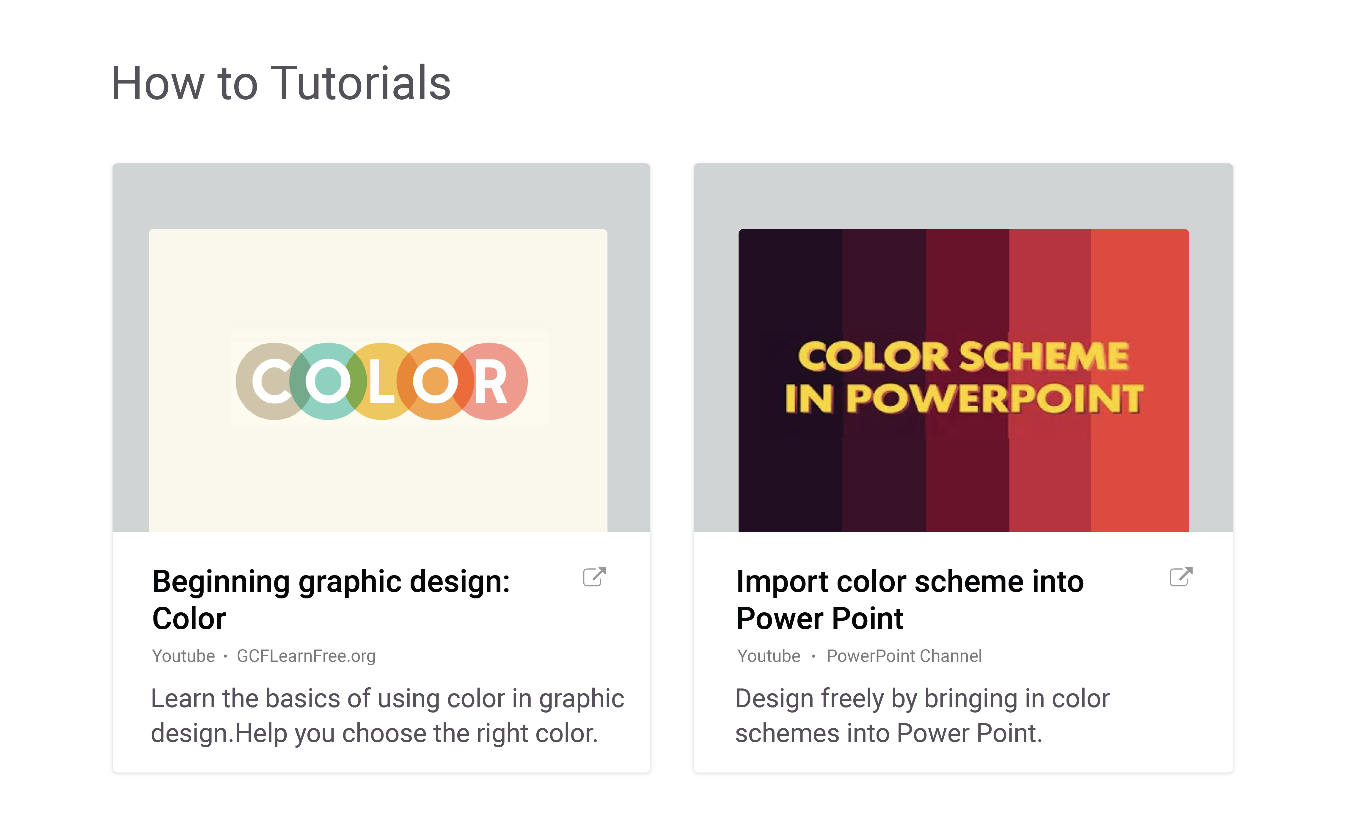
For video-based media, I designed a distinct layout that differs from the standard resource card. Motion or video-related content is presented with a larger visual area to draw attention and clearly distinguish it from other resource formats. This not only improves visual hierarchy but also makes it easier for users to identify the type of learning material at a glance.
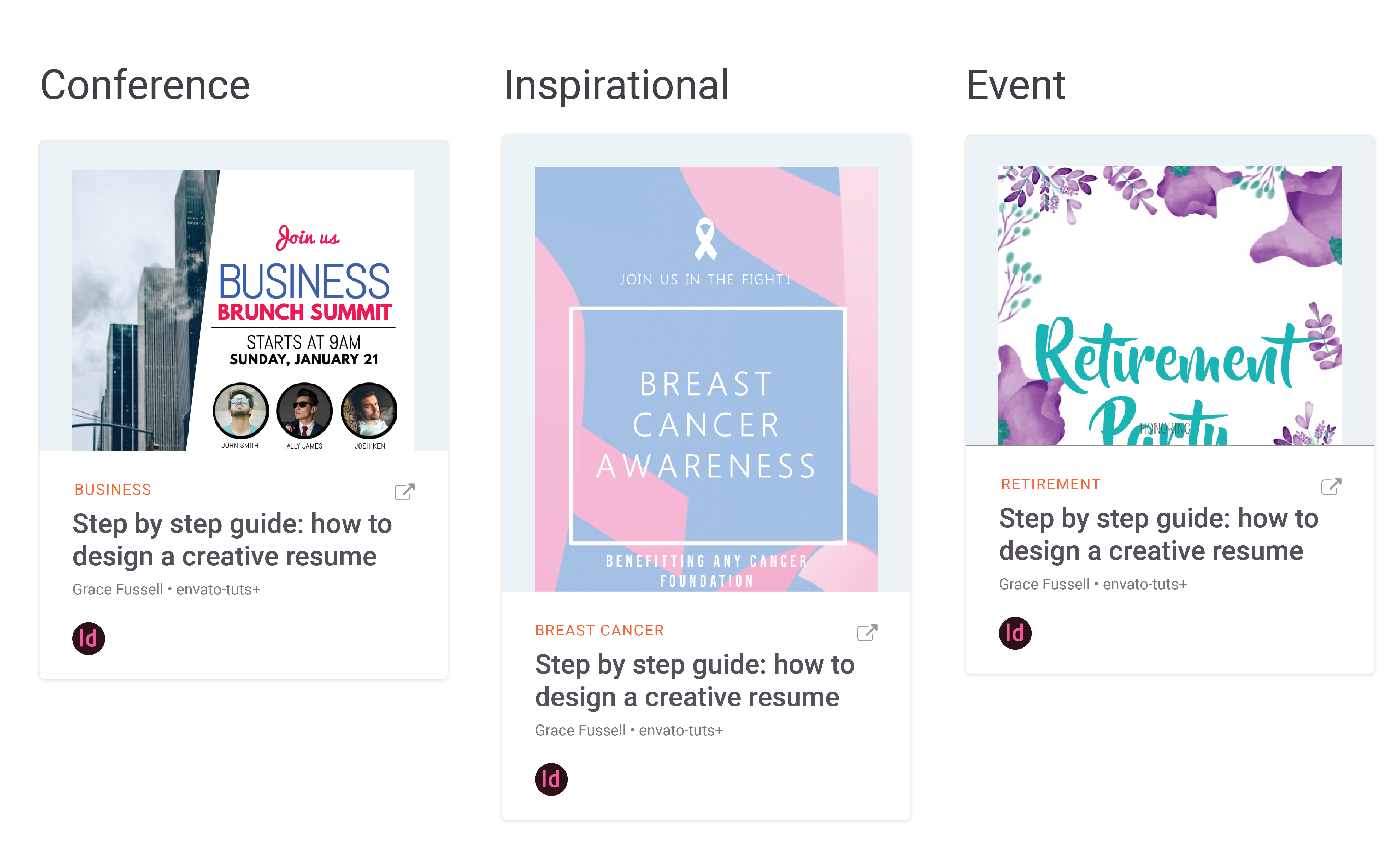
Templates
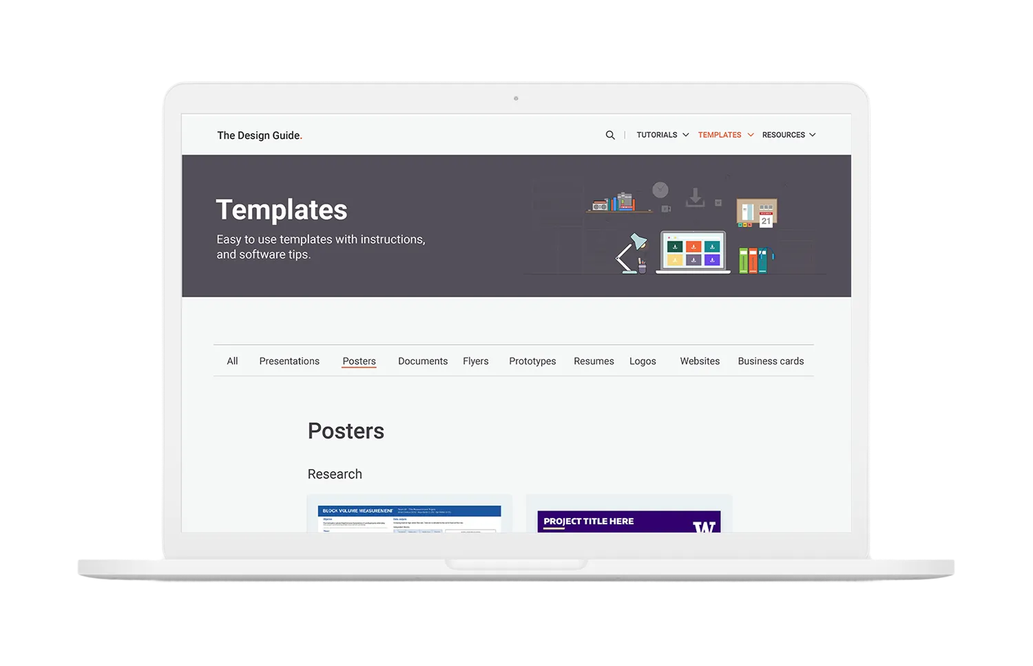
The Template section provides students and faculty with ready-to-use design templates tailored to their needs. This feature is intended for users who want quick access to pre-made templates, complete with instructions for easy implementation.
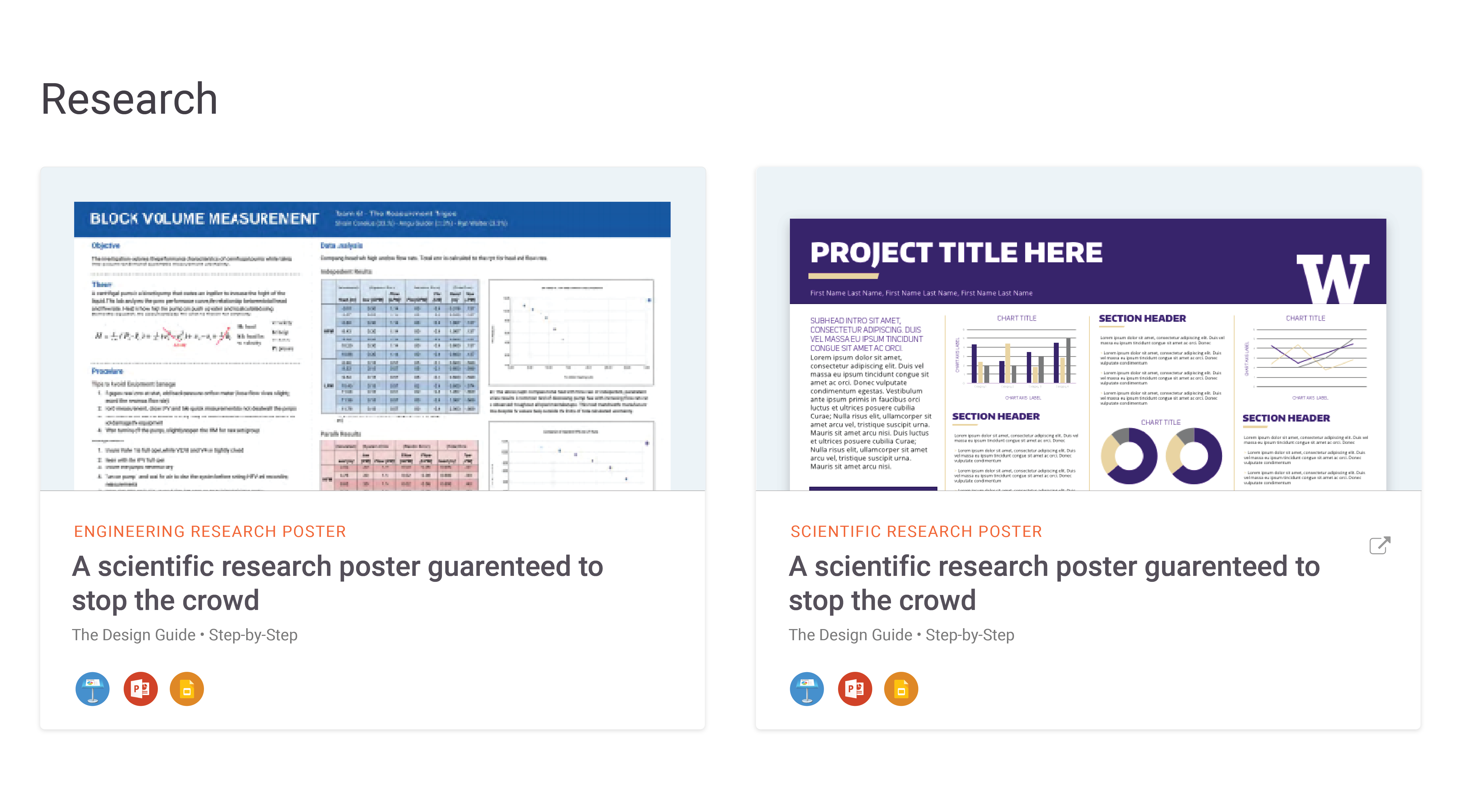
I designed the layout to showcase each template visually through thumbnails, allowing users—most of whom are visual learners—to immediately recognize the type of “poster” or product available. Beneath each template, we include icons indicating which programs or platforms can be used to open and edit the file. By supporting multiple programs, we ensured that students and faculty have flexible options that fit their individual workflows and technical preferences.
This section also highlights additional templates compatible with Adobe tools such as InDesign. Each template clearly displays the program and platform required to open and use it, making it easy for users to quickly identify the right resources for their projects.
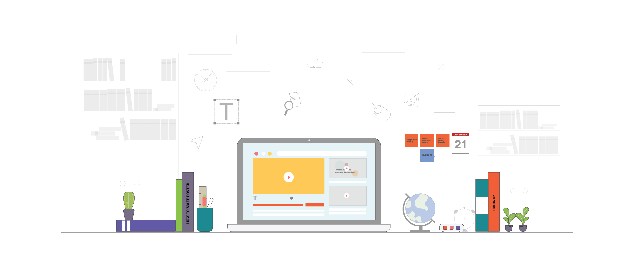
Hero Illustrations
Icons and Illustrations
Along with the hero illustrations, other design tasks, I was responsible for creating the icons displayed on the homepage, representing the various services offered by the Design Guide. I designed the icons using simple shapes and consistent visual elements to ensure clarity, recognizability, and cohesion across the site.
To further support user understanding, each icon is paired with a title and brief description, clearly communicating what each service provides. This combination of visual and textual cues helps users quickly identify and navigate the resources available to them.
Our Process
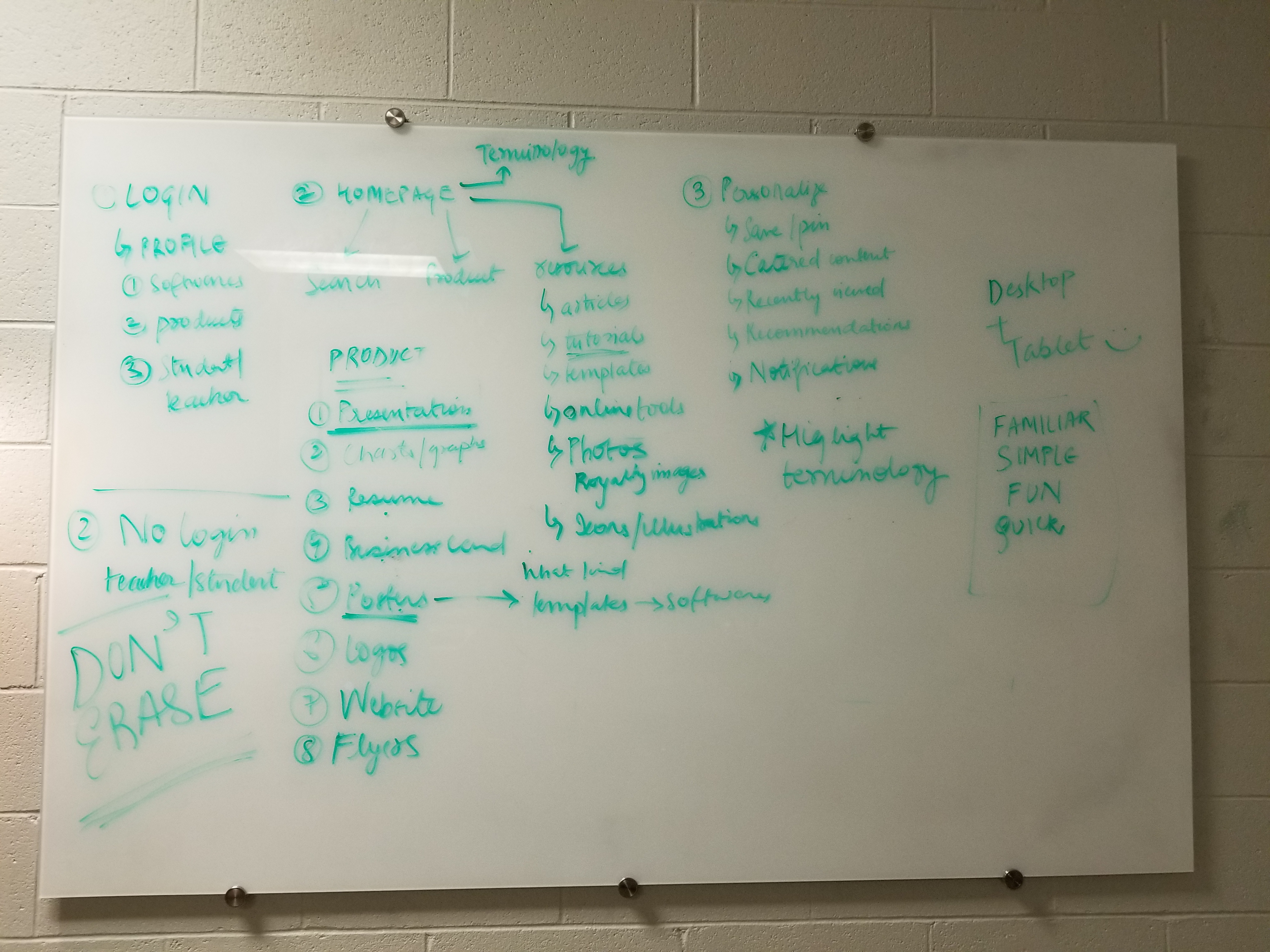
We began the project by understanding the problem and the needs of our users, particularly non-design students who struggled to apply design principles in their projects. Engineering students, for instance, often faced challenges creating capstone posters due to limited guidance and resources.
To address this, we conducted a survey to gather insights on learning preferences and pain points. Using this data, we whiteboarded the user flow and identified the features necessary to meet their needs. Initially, we planned to create separate pages for each design principle. I was assigned to design the Leading page; however, due to time constraints, we refocused on providing essential tools, templates, and resources that users could easily access to learn and apply concepts independently.
After developing the solution, we conducted usability testing with a Marvel prototype. Feedback was positive: users found the design approachable, citing the color palette, content layout, and visual elements as particularly helpful. Visual explanations helped users understand concepts more quickly than text alone, improving their speed and effectiveness in applying design principles.
Through a combination of research, user testing, and visual-first design, the Design Guide empowers non-design students and faculty to learn and apply essential design principles efficiently. By focusing on clear visuals, accessible resources, and intuitive layouts, the project demonstrates how thoughtful design can simplify complex concepts and support a wide range of learning styles.
2 YEARS
While working as a UX designer at RIT for Professor Hye-Jin, I learned the importance of working smarter and staying focused. There were several moments when our team drifted from the original plan, exploring paths that seemed helpful for teaching design principles but ultimately proved to be more time-consuming and difficult to scale.
Over the course of two years, continuous iteration and feedback from real users allowed us to refine and improve the Design Guide into the resource it is today. Through this experience, I gained invaluable lessons in UX design, teamwork, and problem-solving, guiding a project from inception to completion while creating a meaningful tool for RIT students and faculty.
Thank you!