PAYCHEX PPM
– April 2020
Guide for Paychex UX Design Internal tool - PPM
MY ROLE ––
Graphic Design
COLLATERAL –
Digital Flyer
MORE INFO
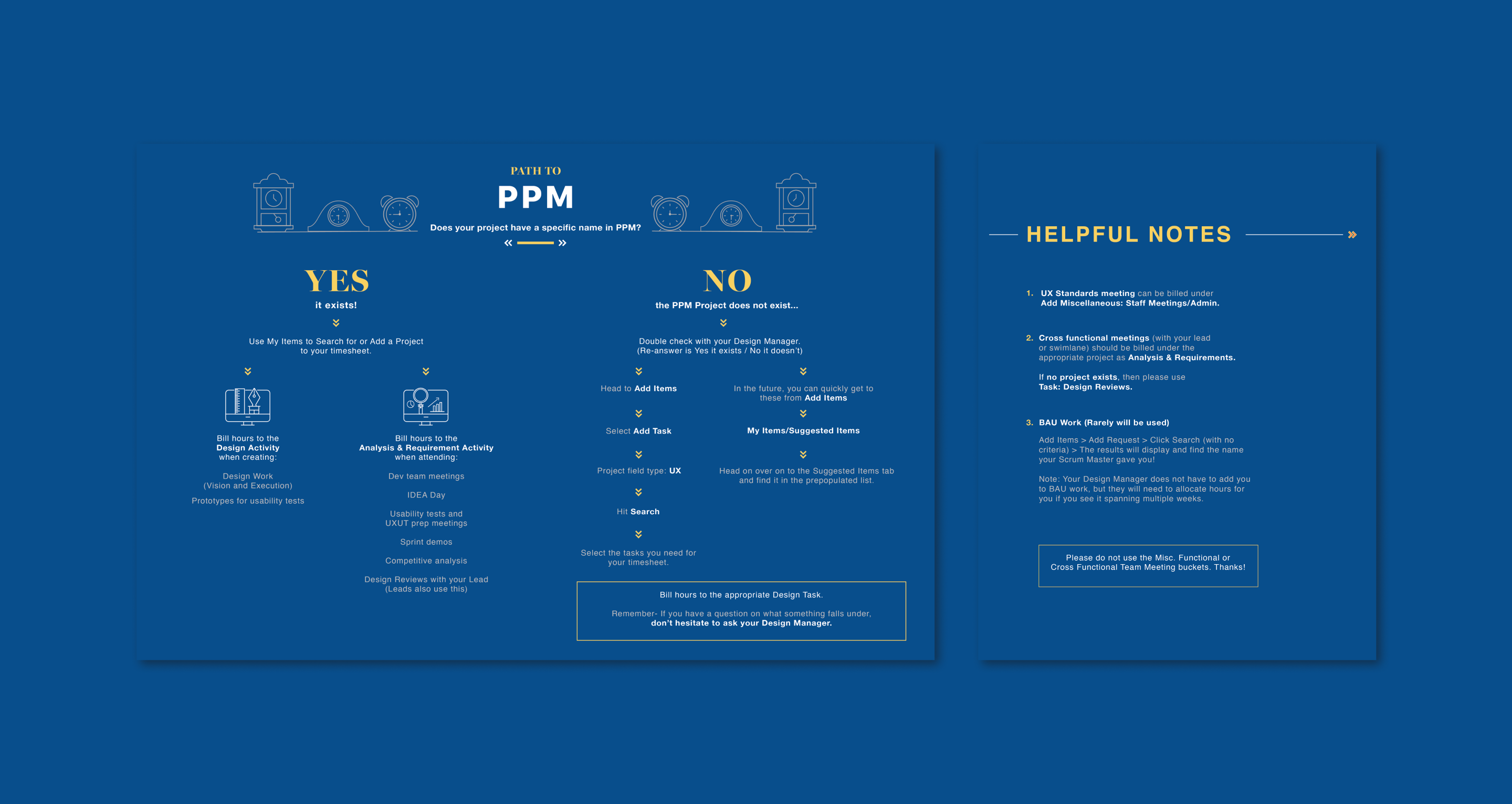
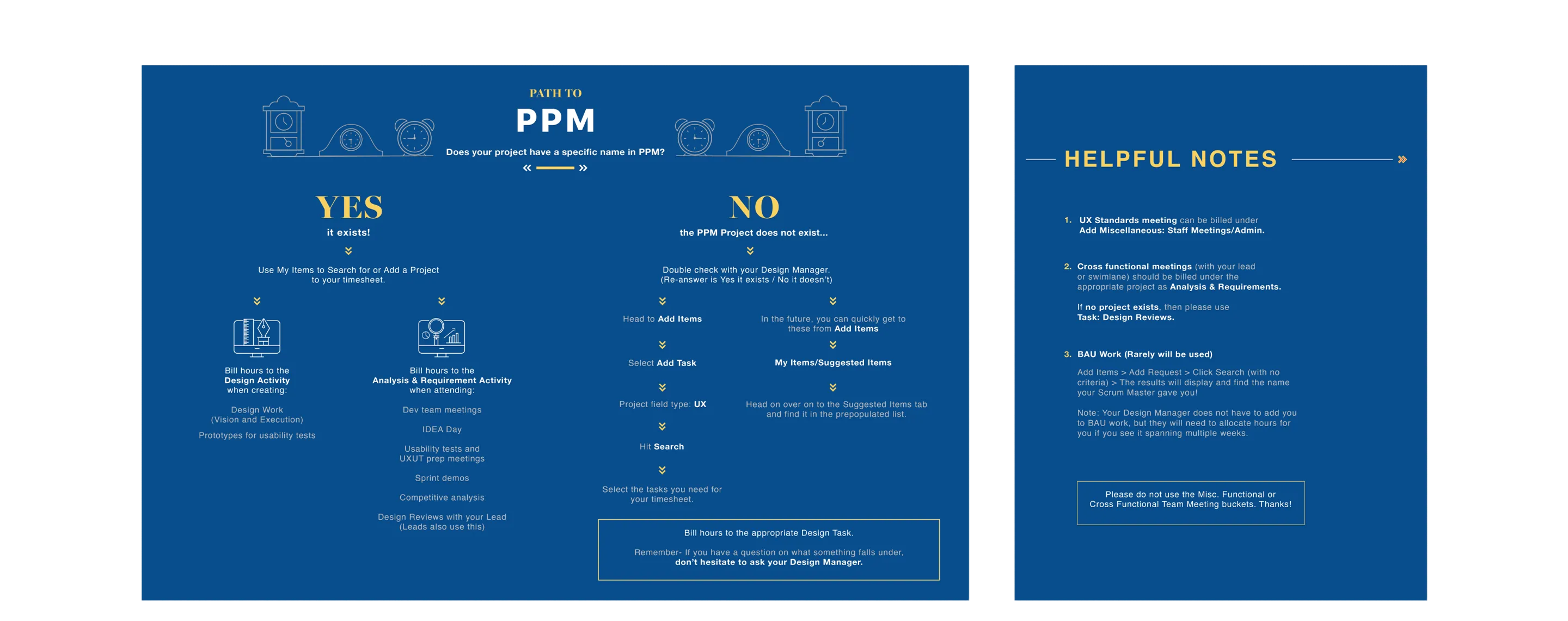
Paychex employees use an internal tool, PPM, to log their hours each week. However, there was no clear guideline on which hours should be allocated to specific projects, resulting in inconsistent entries across the team.
I was tasked with a small graphic design project to help guide the Paychex UX team on where to log their hours based on the types of projects and meetings they attended throughout the week.
I developed two design options for this flyer. The final choice featured a blue background with yellow accents, aligning with Paychex’s primary brand color. To create a friendly yet classic look, I incorporated various clock graphics to visually represent the concept of logging hours.
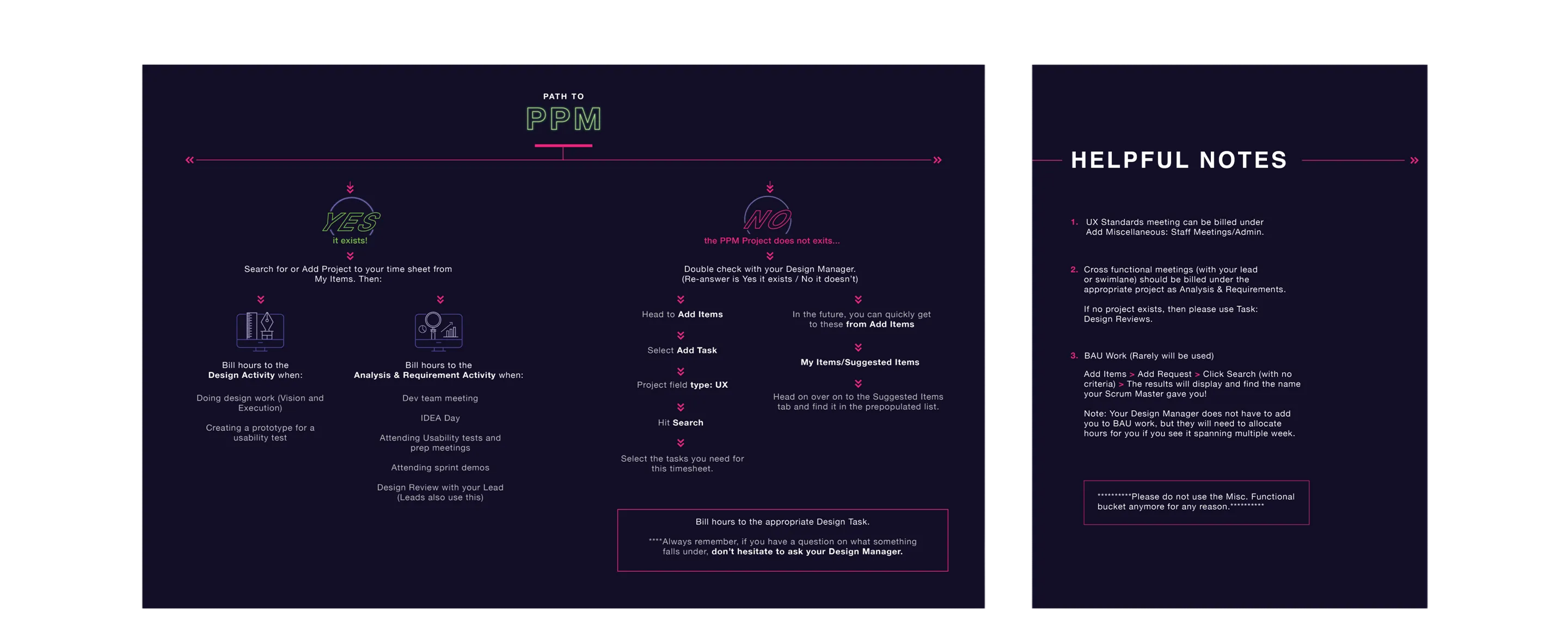
Neon Light
During the pandemic, I wanted to create a design inspired by stores with neon light signs, aiming for an energetic and eye-catching look. This was my first variation, where I experimented with a more unconventional style. However, the strong contrast made readability an issue.
The Golden Time
The clock illustrations were intentional, as this project revolves around the concept of time. This iteration features a variety of clocks in the header to visually reinforce that theme. This style was chosen because it aligns with Paychex’s primary brand color and provides a more calming visual experience, unlike the previous version, which had stronger contrasts that could be straining to the eyes.